Customer Journey Builder
About the project
CrossEngage is a platform made to help marketers to coordinate communication with users using multiple channels (such as email, notifications, social media ads, printed materials, etc) in a single place.
Before we started this project, our users could only create individual campaigns, which didn’t reflect well the customer journeys they had in mind. Only a few of our power users could set such journeys by hacking our tool to create links between these individual campaigns.
Through previous user interviews and feedback we identified the need for a way enable in an easy way all our users to create their customer journeys.
Discovery
When my PM and I were assigned to design a solution for this issue we started by running a series of user interviews focused on this to learn more about needs and pain points as well as collecting a few use cases from them.
With this knowledge, we went into the definition phase, where I started drafting solutions focused on chaining messages and defining delays between them. At this point, the project was deprioritized and parked due to more urgent tasks to be tackled.
A few months later, the project was reprioritized and while I stayed as the designer on it, a new PM was assigned. At this time we also got in contact with some more intricate use cases that the initial concept wouldn’t be able to cover, as it was too linear.
In order to do this we had to shift directions and drop our initial conceptions on it. So I decided to run a benchmarking and to see how competitors and other industries were handling this issue. During this analysis, we notice that:
Too many item types that could be linked. Giving a highly complex feeling to it, and difficulting in the readability of these sequences.
Confuse directions. Some tools we looked into weren’t always clear on what would cause a branch, making it hard to track which path a customer would follow and even allowing customers to follow multiple branches at the same time.
Hard to debug. Trying to activate a journey after spending hours (or even days) creating this complex tree of messages to only then find out it couldn’t be active due to an invalid link somewhere.
Defining our concept
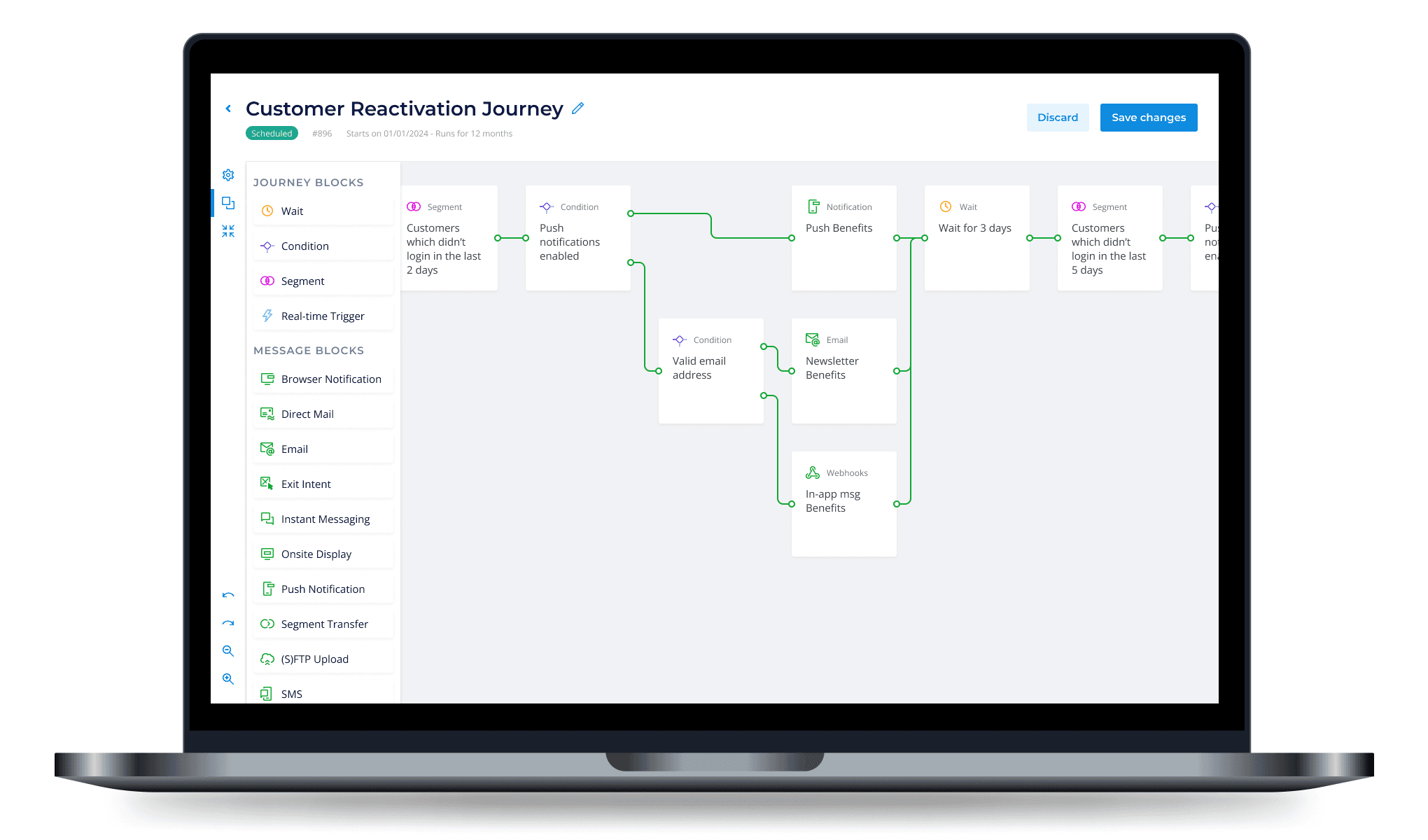
With these insights, we started drafting the minimum amount of elements we needed in order to achieve the new and old use cases. We concluded the most important blocks aside from the messages would be:
Initial customer segmentation and trigger (e.g.: customers in Germany who added a product to the shopping cart);
Conditions (e.g.: Cart value is bigger or smaller than 300 euros?);
Event listener (e.g: customer viewed a product);
And 2 types of time delay: absolute (e.g. wait until next Friday) and relative (e.g. wait for 2 hours).
We then reproduced all use cases we received from our users using these blocks to validate our assumption that these were all the elements we needed for now.
To address the second issue we discovered, I proposed that the condition would be the only way in which a path could branch. Working similarly to a decision block on a flow chart, with a branch if the customer met that criterion and another if they didn’t not.
To address the third issue we noticed in our analysis I introduced icons and color coding on the connection lines. To help identify which block needed to be fixed and which paths were invalid (e.g. due to a previous invalid block).
In order to keep the scope smaller at first we decided to leave the event listener and the absolute time delay out of the first version as most cases could still work without it.
To further validate if the blocks we proposed were enough to reproduce our users’ use cases, I met again with some of them and asked them to execute the same exercise: reproduce their use cases using the printed versions of the blocks.
While this step gave us more confidence that these blocks were a good start for reproducing most use cases, it was also good to present us with a few new ideas, such as splitting the path to multiple branches (e.g: if the customer's cart is up to 100 euros they get one email, if 100€ to 500€ a different email, 500 to 1000€ a third, and if more than 1000€ a fourth different version of it). So we added these ideas to our backlog to add in future iterations of this project.
Developing the solution
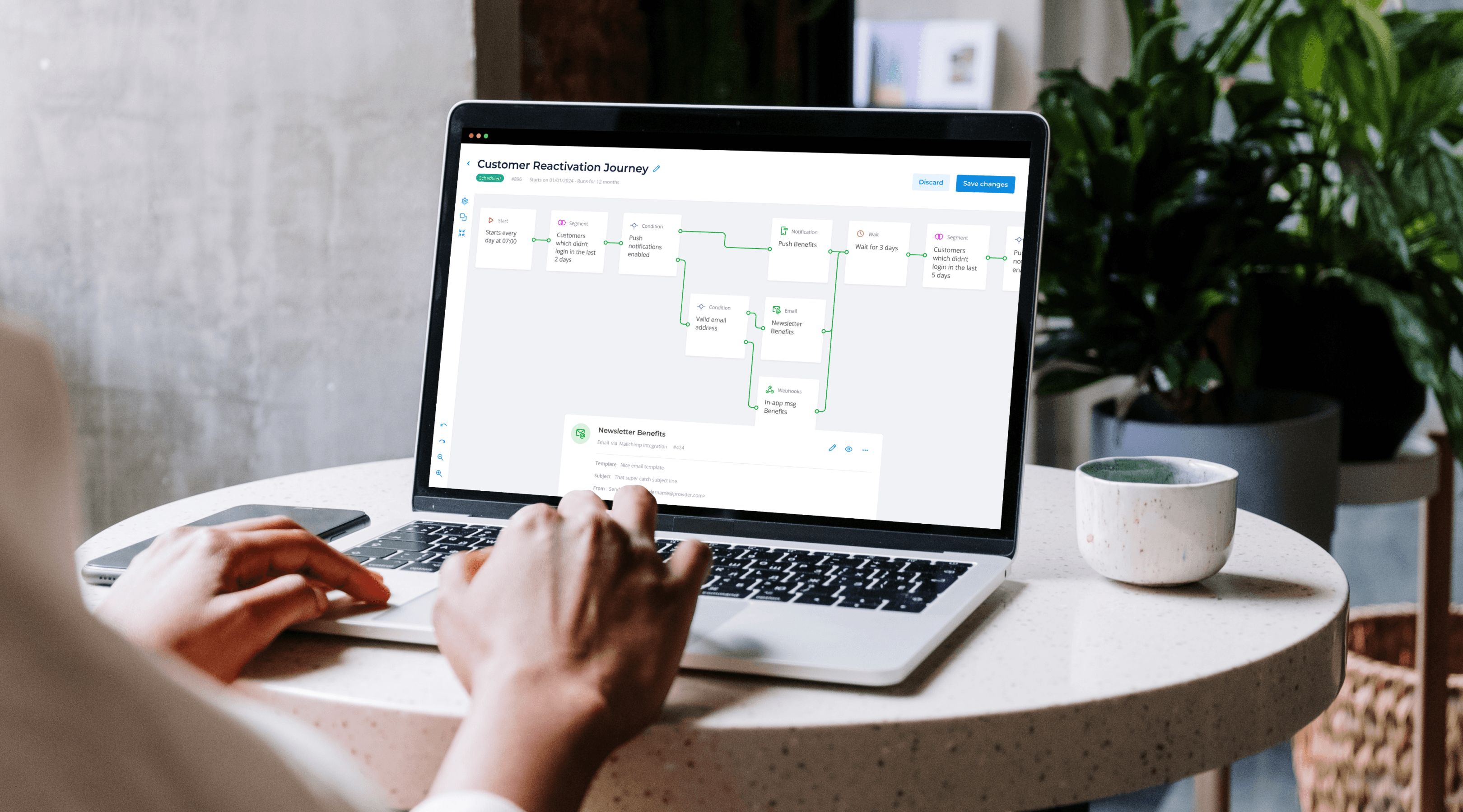
After validating our concept I moved on to designing the visual representations of these blocks and how the interactions of adding and connecting them. I experimented with a few variations of it and landed on a square block, as it allowed us to have more blocks visible side-by-side on the screen.
As part of the handover to developers, I presented them with matrixes of states for the blocks and cards as well as storyboards for the interactions showing how the appearance of the objects changed after each interaction.
As the amount of information on the blocks had to be kept to a minimum, I added a bottom card that appears every time a user clicks on a block, being able to view more information about it as well as edit, preview, disable and delete that block.
This bottom card also came up useful once we introduced the zoom-out option, that on the one hand allowed a better overview of the whole journey and its connections and on the other hid even more information from the blocks.
Once our developers had the first working version of the draggable blocks, I run a usability test to validate the interactions of adding, connecting, disconnecting, and deleting blocks. That helped us confirm some of the proposed patterns as well as learn of new possibilities, such as introducing a drag-to-delete option.
After fixing the most severe learnings from the usability test we then introduced the final version of the project to our users.
Conclusion
Once we introduced this first version of the feature we could finally allow our less technical users to set the customer journeys they dreamed of, and allow our power users to do the same without having to resort to workarounds.
By satisfying this important user need we could increase our client satisfaction rate, helping raise our user retention as well as the acquisition of new clients.
The main learning I got from this project was the reiterated importance of validating our concepts with constant user interviews, real use cases, and simple prototypes before drafting any low-fidelity mockup. Having more freedom to adapt and experiment with different approaches before committing too much to one solution.

