Icons Research
Context
CrossEngage is a platform made to help marketers to coordinate communication with their customers using multiple channels (such as email, notifications, social media ads, printed materials, etc) in a single place.
Problem
While some concepts already have clear icon representations that can be comprehended by the majority of people, at CrossEngage we needed to represent our available channels which didn’t have defined options available, so I went into to creating new icons for them and ensuring our users would understand what each one stands for.
In addition to it, some of these channels were quite similar to each other (email vs mail; push notification vs browser notification), so it was important that the icons would leave no margin to misconceptions or mistakes from our users, as this could cause issues on communication.
Collaborative drafts
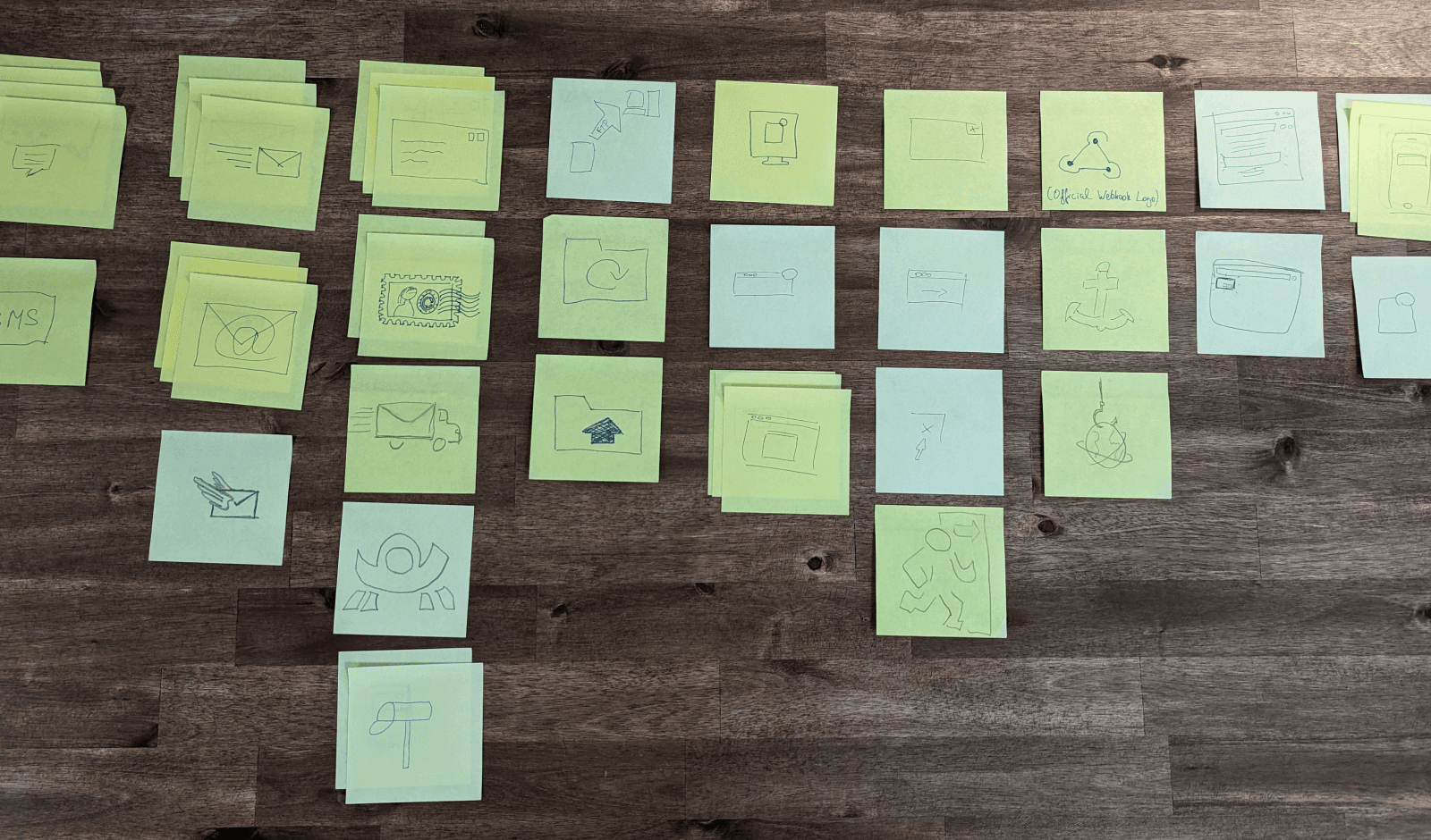
I started by searching for references on how other people solved this issue, which returned very little insight. So I decided to collect ideas from our team by leaving a block of sticky notes next to the office’s coffee machine and sending a message to them asking for their ideas on how to represent each channel.
After a week I collected these cards and started reviewing their ideas, removing some duplicated and problematic designs, but trying not to apply my own bias too much into it. After which I created Mid-fidelity versions of the icons and I scheduled about 7 research sessions with some of our users to help validating it.
Testing the ideas
I divided these sessions into 2 parts:
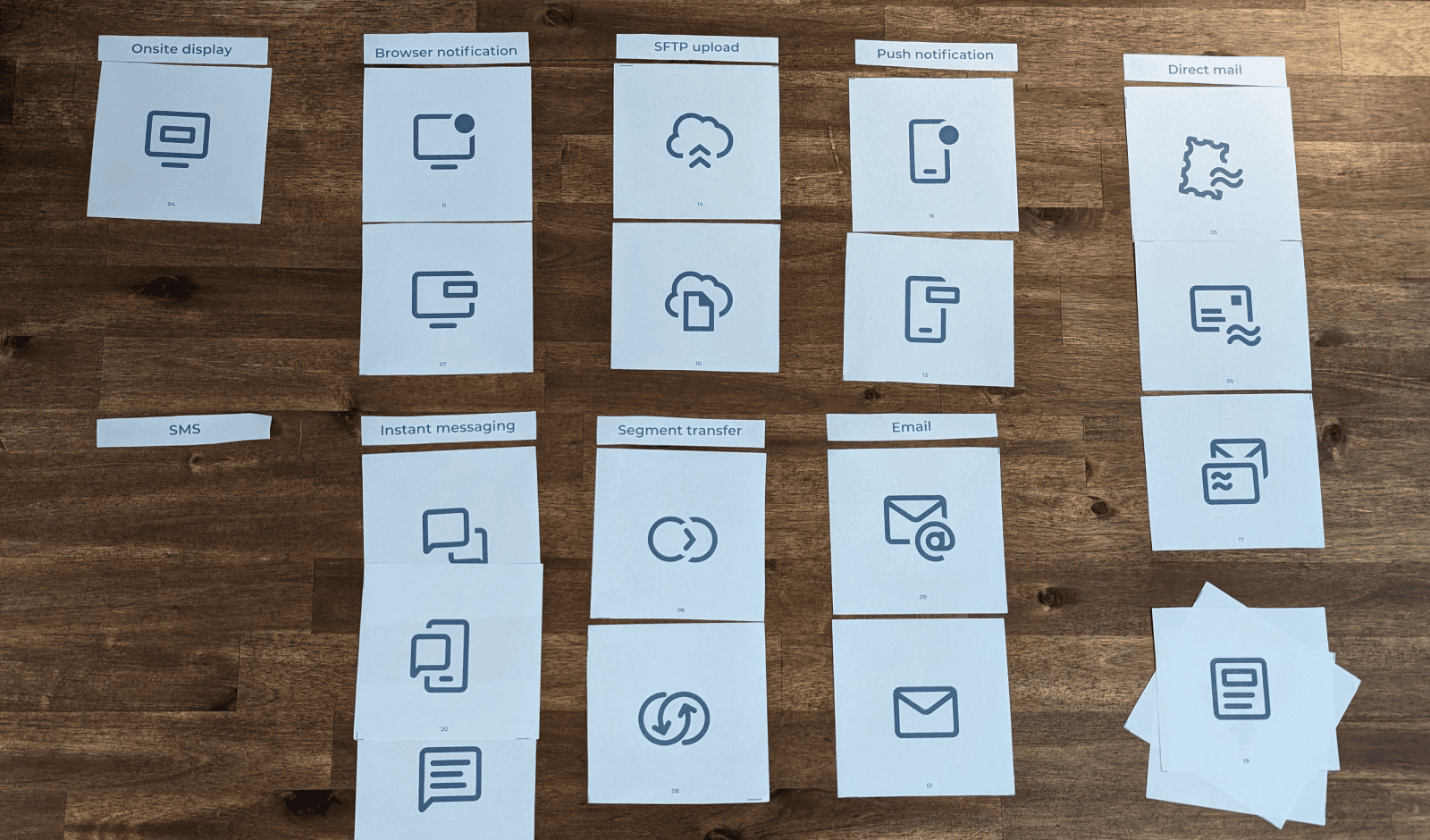
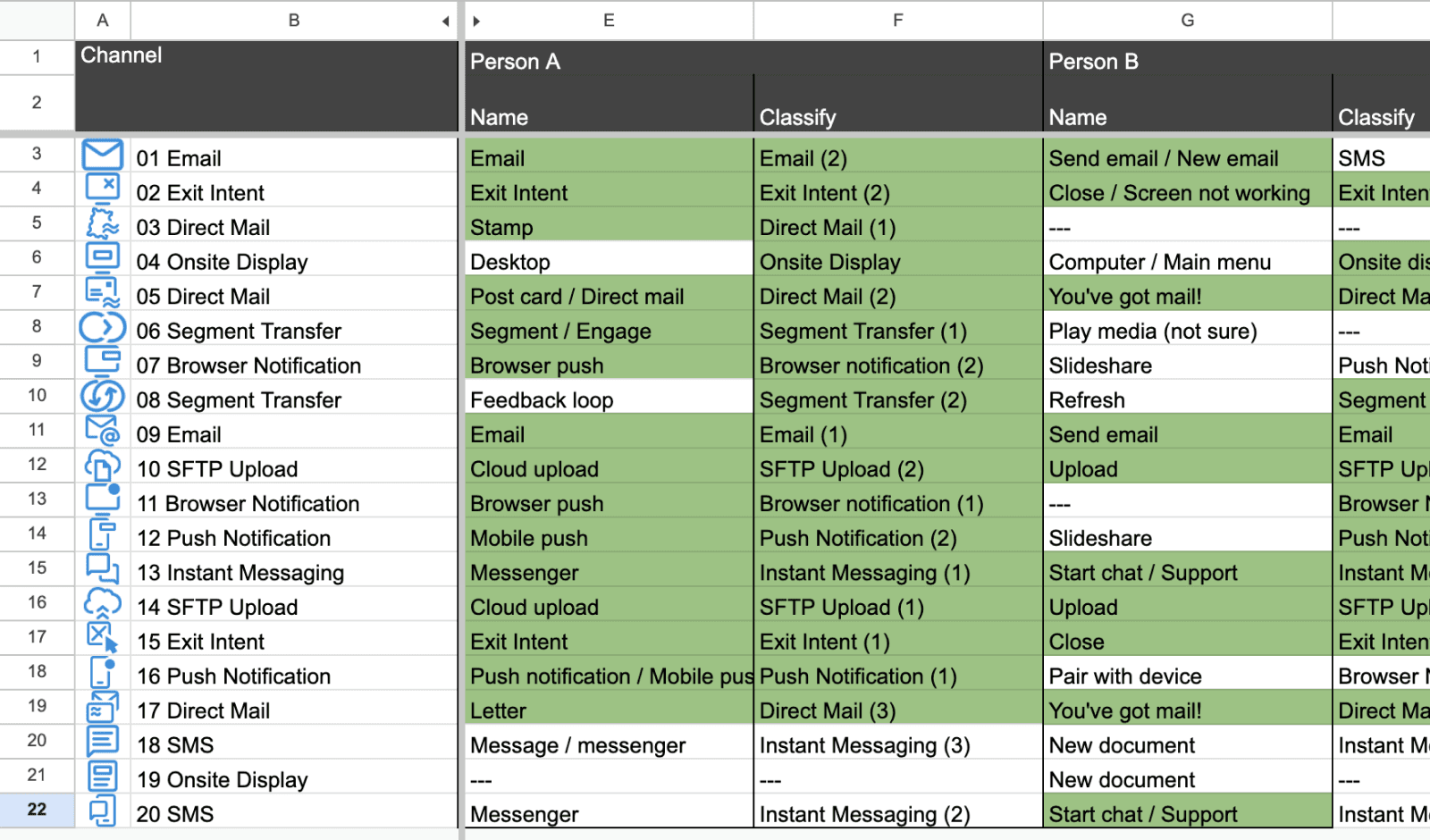
During the first part I run a Open Card Sorting, to see how they interpreted the icons, by letting the participant name their meaning interpretation to each icon.
During the second part I run a Closed Card Sorting, to see how they interpreted the icons considering the channels available on our platform as a context, by letting them assign the icons to one of the channels. And as we had more icons than channels, each channel could take multiple icons.
Final design solution
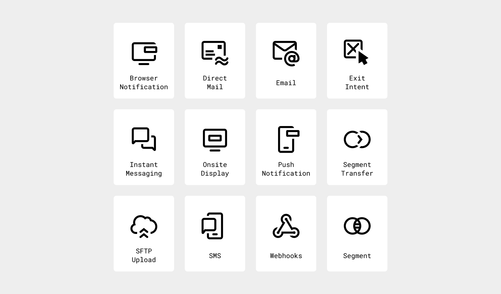
After comparing their different inputs I could finally select a version for each channel and refine these icons so they follow our visual style, fit together with other existing icons, and could be used on our next project.
In conclusion, the testing gave me and the team the confidence that the ambiguity and overlap of meanings was handled. Which was important for us to be able to use these icons independent of text in some situations, as during the design of the Stories feature.


